CSS Houdini C’est plus que de la magie !
Vincent De Oliveira · @iamvdo
Hello, c’est @iamvdo
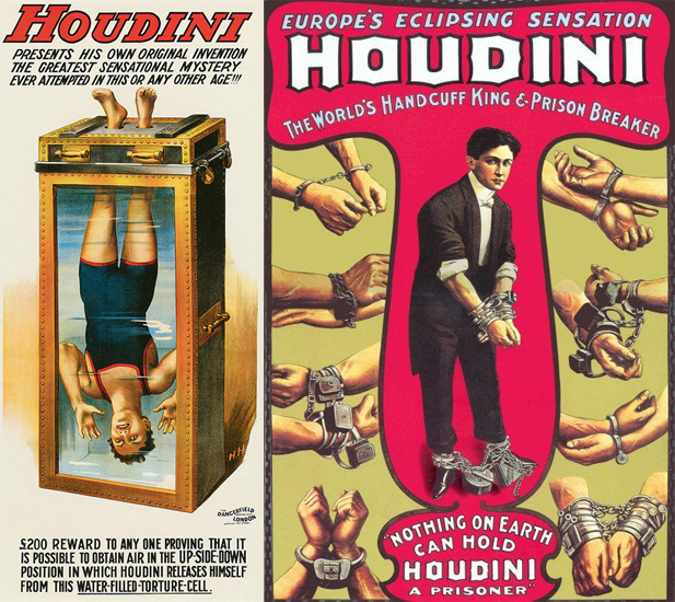
Harry Houdini
Mais alors pourquoi Houdini en CSS ?
Il est aujourd’hui difficile impossible de polyfiller CSS, même avec JS
L’innovation prends du temps et demande des consensus
Welcome Houdini
Nombreuses APIs
CSS Custom Properties · CSS Parser API · Box Tree API · CSS Properties and Values API · CSS Typed OM · CSS Layout API · CSS Painting API · Font Metrics API · CSS Animation Worklet API
JS-in-CSS
CSS Custom Properties
Pas spécifique à Houdini
/* Propriétés raccourcies */
.el {
  box-shadow: var(--box-shadow-x, 0) var(--box-shadow-y, 3px)
              var(--box-shadow-blur, 3px)
              var(--box-shadow-color, rgba(0,0,0,.75));
}
.el:hover {
  --box-shadow-y: 15px;
  --box-shadow-blur: 10px;
}/* Avec JavaScript */
.el {
text-shadow: var(--text-shadow-x, 0)
var(--text-shadow-y, 3px)
var(--text-shadow-blur, 3px)
var(--text-shadow-color, rgba(0,0,0,.75));
}el.addEventListener('mousemove', e => {
el.style.setProperty('--text-shadow-x', e.offsetX)
el.style.setProperty('--text-shadow-y', e.offsetY)
el.style.setProperty('--text-shadow-blur', blur)
})CSS Custom Properties ++
Avec Houdini Properties & Values API
// Déclarer notre propre propriété animable
CSS.registerProperty({
  name: '--box-shadow-blur',
  syntax: '<length>',
  inherits: false,
  initialValue: '0px'
})
.el {
transition-property: --box-shadow-blur, --box-shadow-y;
transition-duration: .45s;
}
.el:hover {
--box-shadow-y: 15px;
--box-shadow-blur: 10px;
}Démo : Animer un dégradé
Peut-on utiliser Houdini ?
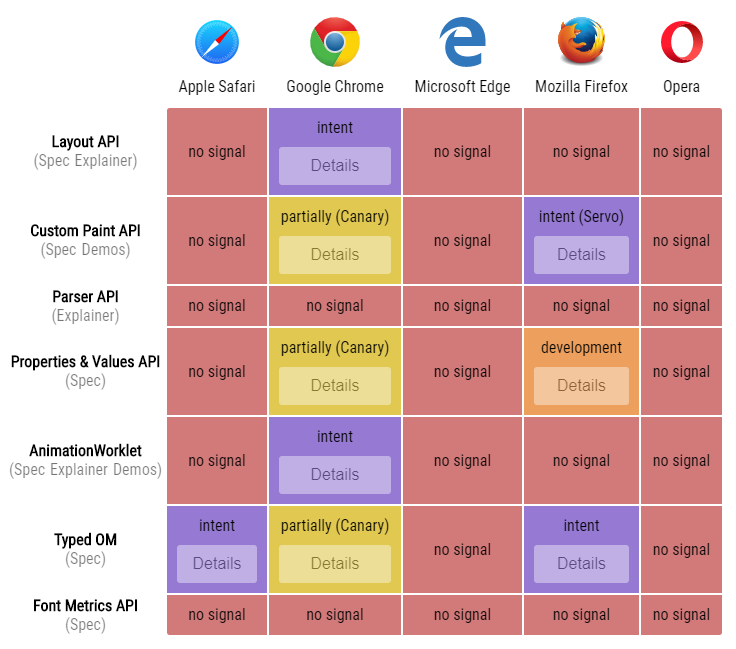
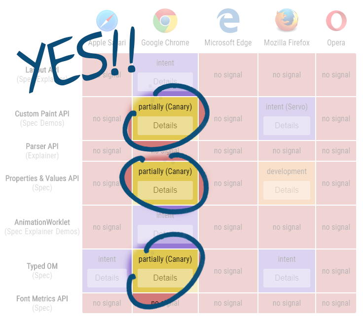
Amélioration progressive FTW
Creative time
avec CSS Painting API
Chrome Canary ou Chrome, avec flag «web platform» activé
registerPaint('circle', class {
  paint(ctx, geom, props, args) {
    // Get the center point and radius
    const x = geom.width / 2;
    const y = geom.height / 2;
    const radius = Math.min(x, y);

    // Draw the circle
    ctx.fillStyle = 'deeppink';
    ctx.beginPath();
    ctx.arc(x, y, radius, 0, 2 * Math.PI);
    ctx.fill();
  }
}
.el {
background: paint(circle);
}registerPaint('circle-props', class {
static get inputProperties() { return ['--circle-color']; }
paint(ctx, geom, props, args) {
// Determine the center point and radius.
const x = geom.width / 2;
const y = geom.height / 2;
const radius = Math.min(x, y);
// Draw the circle
ctx.fillStyle = props.get('--circle-color').value;
ctx.beginPath();
ctx.arc(x, y, radius, 0, 2 * Math.PI);
ctx.fill();
}
}.el {
--circle-color: deepskyblue;
background-image: paint(circle-props);
}registerPaint('circle-ripple', class { static get inputProperties() { return ['--circle-color', '--circle-radius', '--circle-x', '--circle-y'];} paint(ctx, geom, props, args) { const x = props.get('--circle-x').toString(); const y = props.get('--circle-y').toString(); const radius = props.get('--circle-radius').toString(); } }el.addEventListener('click', e => { el.classList.add('animating'); el.style.setProperty('--circle-x', e.offsetX); el.style.setProperty('--circle-y', e.offsetY); });
.el {
  --circle-radius: 0;
  --circle-color: deepskyblue;
  background-image: paint(circle-ripple);
}
.el.animating {
  transition: --circle-radius 1s,
              --circle-color 1s;
  --circle-radius: 300;
  --circle-color: transparent;
}
Démo : Polyfill conic-gradient
Démo : Dégradé des 4 coins
Démo : Case à cocher
Démo : Propriétés d’arrière-plan
Démo : Bordures dessinées
Démo : Entête non rectangulaire
Démo : Polyfill corner-shape
Démo : Coins arrondis smooth
Démo : Effet wobble
What’s next?
Les autres worklets
Créer son layout
registerLayout('masonry', class {
  *layout(space, children, styleMap, edges, breakToken) {
    // create layout
  }
}
.el {
display: layout(masonry);
}Créer son animation
registerAnimator('header', class {
  animate(currentTime, effect) {
    // compute
  }
}
const workletAnim = new WorkletAnimation('header',
[
new KeyFrameEffect($avatar,
[{transform: 'scale(1)'}, {transform: 'scale(0.5)'}],
{duration: 1, iterations: 1})
],
new ScrollTimeline($scrollingContainer, {timeRange: 1})
);Encore plus loin…
Créer ses fonctions
/* fonctions de couleurs */
.el {
  color: alpha(red, .5)
}

.el {
  /* préciser top, right, bottom, left */
  position: absolute(0, 0, 0, 0)
  /* definir le containing block */
  position: absolute('#container')
}
Créer ses sélecteurs
/* pseudo-classes */
.el:parent {
  ...
}

/* sélecteurs de voisins précédents */
li - li {
  ...
}
Créer ses @rules
/* polyfill */
@counter-style check {
  system: cyclic;
  symbols: '\2713';
  suffix: ' ';
}
.el {
  list-style: check;
}

/* element queries */
.el {
  ...
  @element (var(--width) <= 300px) {
    ...
  }
}
Sky’s the limit
Wait & See
Les plus / les moins
- Augmente les possibilités, mais basé sur JavaScript
- Gain en performance, quoique pas forcément dans tous les cas (Paint)
- Inexistance de standards, mais ça permettra d’innover (et donc de standardiser peut-être)